


The Homer Paradox
“Facts are meaningless. You could use facts to prove anything that's even remotely true!” - Homer Simpson


A silent but efficient killer hid among us. In less than ten years, the number of deaths in America had doubled. It hid in plain sight as a welcomed and frequent guest in our homes, schools, and workplaces. Despite the decade-long surge, not a single intervention, hearing, or protest was held.
As often happens, the resounding call for change began with a singular voice. While studying at Harvard Law School, Tyler Vigen stumbled upon the seriousness of the threat we faced and, with a 94.7% correlation, the most likely cause. At long last, we had the data to set us free.
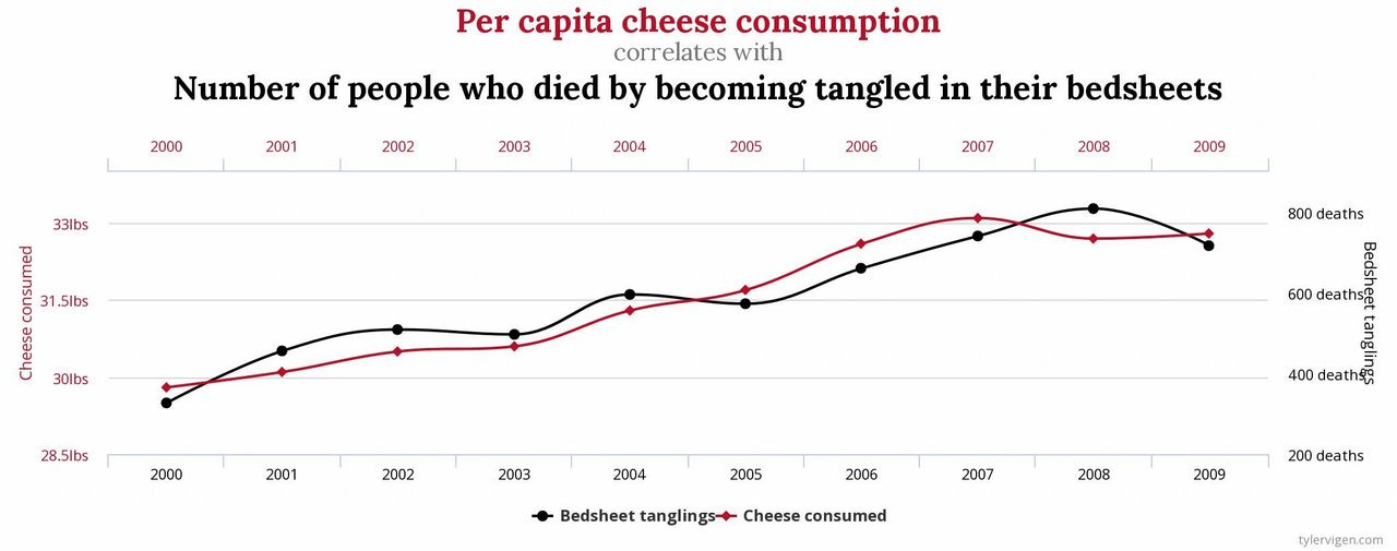
This story is clearly ridiculous. As the title of Mr. Virgen's site suggests [1], the correlation between these two variables is spurious. We all know that correlation doesn't imply causation, so any attempt to influence more than a chuckle with this data would be borderline criminal. At best, this data is misleading. At worst, it's a lie.
And yet, how often do we rely on charts that look just like this? It's easy to discount the connection when the premise is absurd, but less so when you believe the variables are related. Think of the last time you were investigating the cause of a jump in conversion rate or precipitous fall in Net Promoter Score (NPS). How did you approach it? If you're like most people, you looked for the timing of the inflection point, thought of what changed around that same time, and then plotted the two together to see if there's a match.
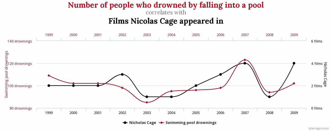
The difference is our willingness to believe the data comes down to the context in which it is presented. The chart above is so offensive because there's no reasonable causal explanation. The problem is we don't apply the same level of rigor when evaluating a ridiculous premise as we do with one that rings true. We'll generate several theories for why the number of drownings correlates with the number of Nicholas Cage movies [2], but stop at one when we see the jump in customer satisfaction lines up with the timing of our new product offering. Both cases are supported by data, yet our scrutiny of the story we're telling is selectively applied.
Furthermore, it's possible to tell two different stories with the same data set. On a recent episode of Axios on HBO [3],President Donald Trump and Axios's National Political Correspondent Jonathan Swan got into a heated debate about how well the United States was handling the COVID-19 pandemic. Mr. Swan expressed concern at the rising number of deaths, whereas President Trump argued he was wrong, and, in numerous categories, we were "lower than the world." Here's an excerpt from the interview:
Trump - Look. Take a look. Right there. Here is case death.
Swan - Oh, you’re doing death as a proportion of cases. I’m talking about death as a proportion of population. That’s where the U.S. is really bad, much worse than South Korea, Germany, et cetera.
Trump - You can't do that.
Swan - Why can't I do that?
Trump - You have to go by where...look. Here is the United States. You have to go by the cases. The cases are there.
Politics aside, the exchange here is not about the data itself but in how it's used. Both are using data to make their case, likely from the same source, but the context in which it is presented is entirely different. Regardless of your position on this particular issue, the broader takeaway is presenting data isn't the same as presenting the truth.
James Barksdale, the former CEO and President of Netscape Communications, once said "If we have data, let's look at data. If we have opinions, let's go with mine." While admirable, the fallacy within this quote is that there isn't always a distinction between data and opinions. As Homer alluded to, data (like facts) can be used to prove anything even remotely true.
Herein lies Homer's paradox. We equate data with the truth, but how we capture and present data creates a distinction that we fail to recognize. When we rely on data to tell the story, we neglect to acknowledge the impact of our role as narrator. The data is biased not because it has a preference, but because we do.
This isn't to say that we should abandon data. Instead, we need to re-evaluate how we leverage it. Rather than being data-driven, we need to be data-informed, which recognizes the trap of conflating data with the truth. At best, data is a half-truth that requires context, and it's the context where our bias so often seeps in.
In short, we need to appreciate that as data storytellers, we can be unreliable narrators.
Sources and Footnotes
1. Tyler Virgen's Spurious Correlations - https://www.tylervigen.com/spurious-correlations
2. Yep, that correlates, too...
3. Watch the full Axios on HBO interview with Donald Trump